March asks us to notice the light changing. The days are getting longer, the mornings feel gentler, and there's a softness in the air that wasn't there before. It's the month for spring tea that steeps slowly, for kitchens filled with butter and fresh herbs, for afternoons that unfold without a schedule. This month's color story reflects that quiet shift: sage, butter yellow, and cream. Soft, grounded, and full of warmth. These are colors that feel like the first real breath of spring.

The Palette
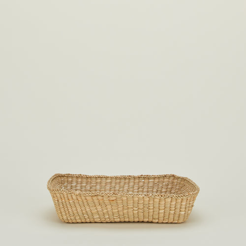
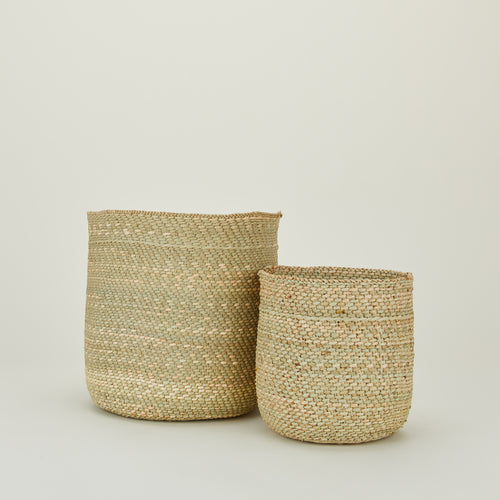
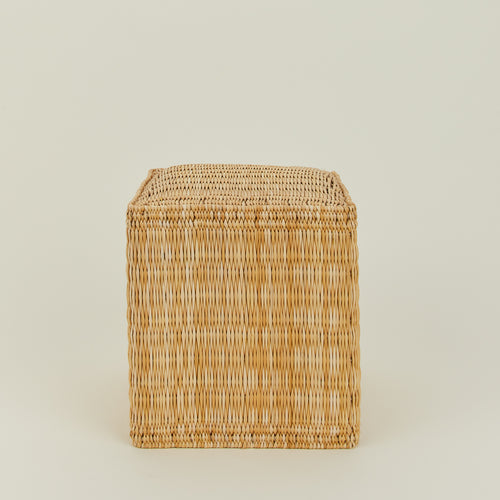
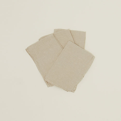
Sage: A soft, earthy green that brings calm to any space. Sage is linen napkins at the tea table, woven baskets on open shelves, and the color of herbs growing on a windowsill. It's grounded but fresh, muted but alive. In March, when everything outside is just starting to wake up, sage brings that same gentle energy indoors.
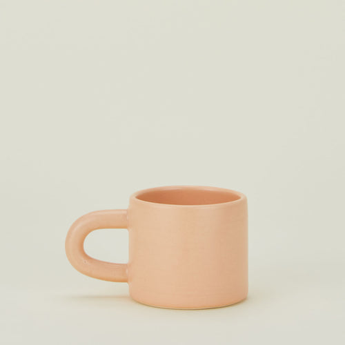
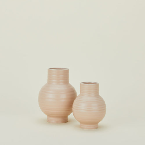
Butter Yellow: Warm, sunny, and impossible to ignore in the best way. Butter yellow is the color of morning light streaming through kitchen windows, fresh eggs cracked into a bowl, and the kind of cheerfulness that doesn't try too hard. It's softened just enough to feel sophisticated, not loud: pale daffodils, creamy butter in a dish, or a favorite mug that makes you smile every time you reach for it.
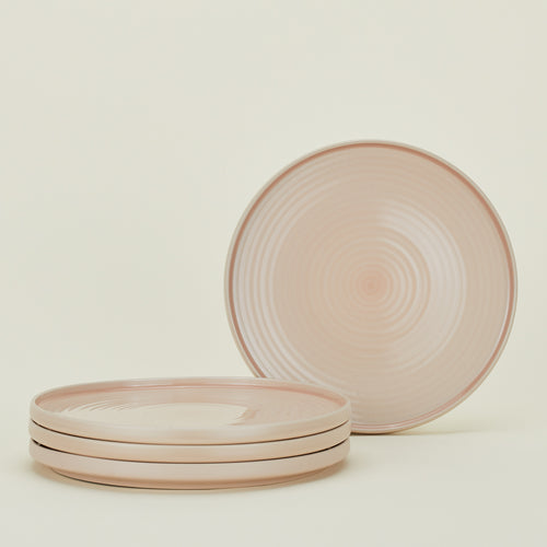
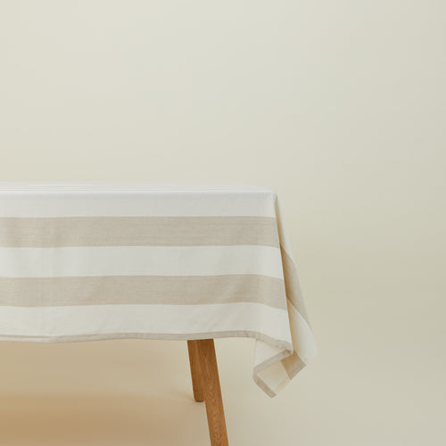
Cream: Timeless, versatile, and the perfect backdrop for everything else. Cream is linen tablecloths that get softer with every wash, porcelain plates stacked in the cupboard, and the kind of neutral that makes a room feel open and calm. It works everywhere, pairs with everything, and never competes for attention.

The Mood
Sage, butter yellow, and cream feel like the colors of an English country kitchen in early spring. They're what you reach for when you're setting the table for afternoon tea, baking something from scratch, or just making the kitchen feel like the heart of the home.
Picture a cottage kitchen with wildflowers in a butter yellow vase, sage linen napkins folded beside cream porcelain plates, and a teapot warming on the stove. The table is set for friends (or maybe just for you). The kettle whistles, the scones are cooling, and there's nowhere else you need to be. These colors don't demand anything from you. They just make everything feel a little softer, a little warmer, a little more intentional.

Style It
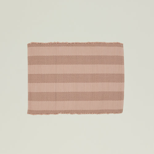
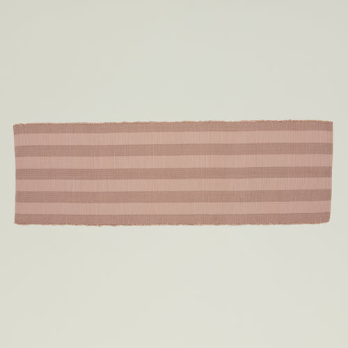
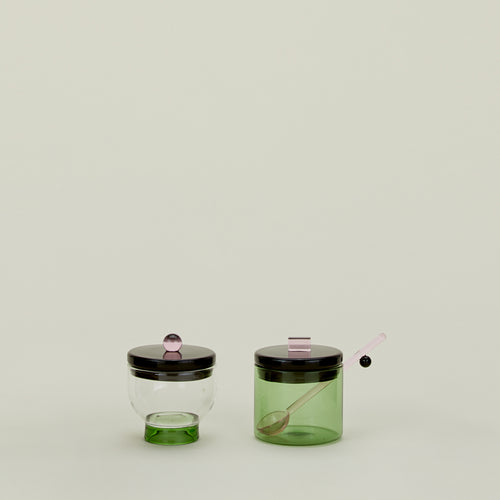
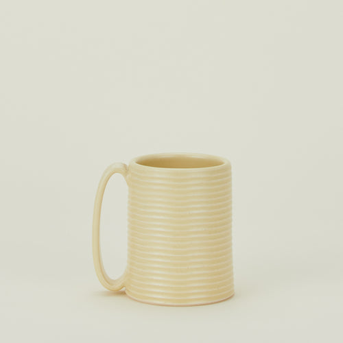
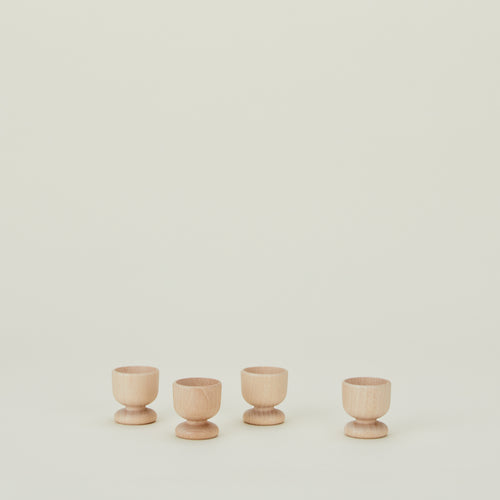
In the Kitchen: Start with cream ceramics like simple porcelain plates, cottage mugs, and hand thrown mugs. Layer in butter yellow through splatter mugs, essential ceramic vases, or a pop of color on open shelving. Add sage with linen napkins, gingham tablecloths, and chambray stripe kitchen towels. The result is a kitchen that feels fresh, warm, and ready for spring.
On the Tea Table: Set an English country inspired tea table with essential gingham napkins in sage, simple porcelain espresso mugs, and a three tiered serving tray for scones and sweets. Add butter yellow through fresh flowers in a vase or a cheerful mug. Cream porcelain plates and linen tablecloths tie it all together. It's the kind of table that makes you want to steep a pot of tea and stay awhile.
In the Bedroom: Layer cream linen bedding with a simple linen throw in sage draped at the foot of the bed. Add butter yellow through pillows or a cozy blanket. Keep it soft, keep it simple, and let the colors do the work. The bedroom becomes a place that feels like spring, even when it's still cold outside.
In the Bathroom: Hang sage linen towels, add cream bath mats, and bring in a pop of butter yellow through a ceramic soap dish or small vase with fresh flowers. Even the smallest spaces benefit from a cohesive color story.

This month's palette isn't about a full redesign. It's about noticing where you can add a little warmth, a little green, a little light. Sage, butter yellow, and cream work because they feel like spring without being obvious about it. They're the colors of mornings that linger, tea that steeps slowly, and kitchens that feel alive.
So put the kettle on, set the table with the good linens, and let March unfold at its own pace.