COLOR THEORY 101
When you hear the phrase “Color Theory”, you might assume it’s an intricate, academic, possibly thesis-length idea about how to properly use colors; some secret way to maximize making color payoff that most people are sadly uneducated about. In actuality, color theory is simply the science behind which colors go well together and the art of color combinations, based on the good ole color wheel. Don’t tell the others but… it’s something you probably learned about in elementary school art class.
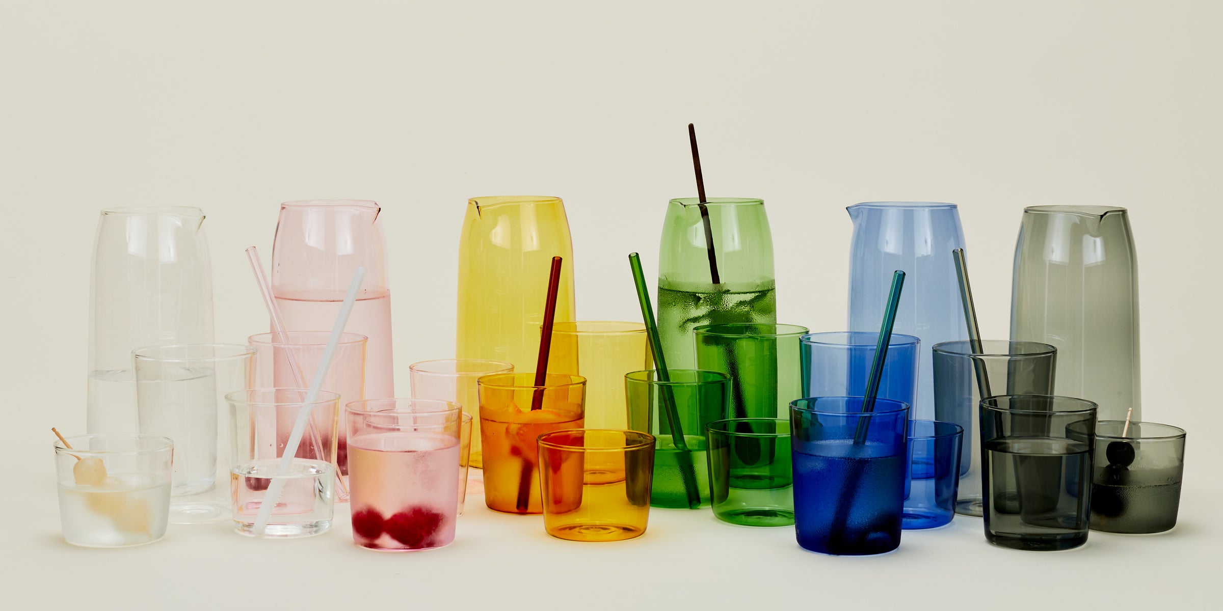
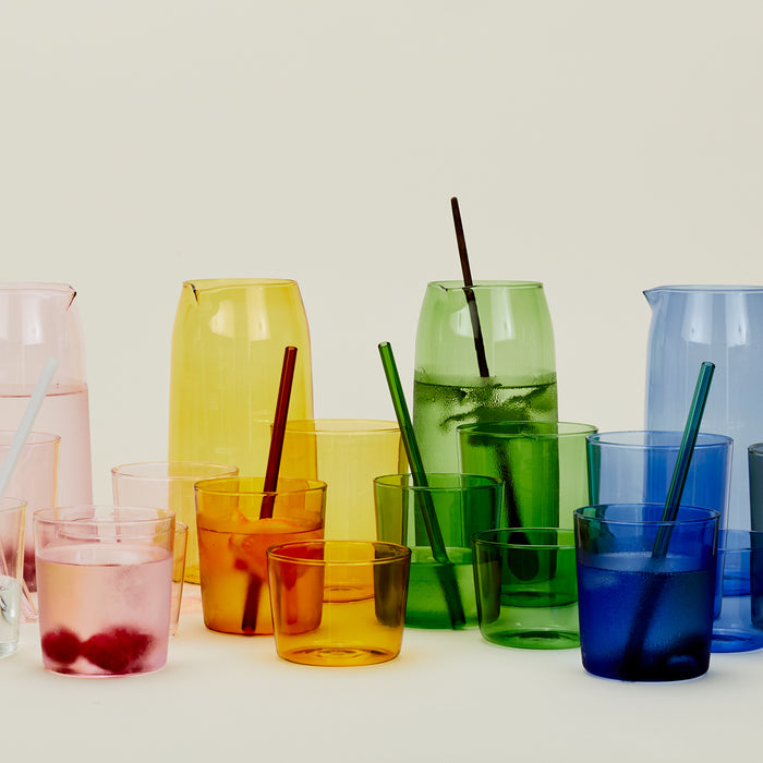
Using the classic color wheel, color theory allows designers and artists to communicate visually by strategically mixing colors to draw out emotions or meet specific goals. Some common ways to use color theory are through complementary colors (colors opposite each other on the color wheel), color contrasting (color blocking with bold hues), or implementing a triadic color scheme (three colors spaced evenly from one another, forming a triangle). For an interior designer, color theory is used to combine colors that are aesthetically appealing to a client while effortlessly maintaining the flow and energy of a space. For visual artists, it’s often used to create a color palette that’s evocative of a specific emotion like anger or relief, or by combining color and form in a way that projects cultural symbolism. These examples highlight another reason why color theory can be an incredibly impactful tool: because of the psychology of color.
The psychology of color is a study of how colors affect human behavior, emotions, and mood. If you’ve ever felt anxious and moody when entering an art exhibit full of deep red canvases, or lighter and happier when walking through a field of bright yellow daisies, you have the psychology of color to blame (or thank). Here are some of the other associations between color and emotion:
Red: A powerful color often associated with passion, love, and energy.
Yellow: A cheerful and energetic color often associated with happiness and optimism.
Green: A relaxing color often associated with nature and growth.
Blue: A cool and calming color often associated with tranquility and peace.
Purple: A regal and luxurious color often associated with creativity and spirituality.
Orange: A warm and revitalizing color often associated with enthusiasm and excitement.
On a deeper level than simple preference, the colors we see have a genuine impact on our experience, especially when we’re surrounded by them, so it’s great to have color theory and the psychology of color in your back pocket. And because we’re your favorite place for all things home, we highly recommend using these practices to maximize the payoff of your home decor.
HOW TO USE IT
There are two central ways to implement color theory into your decorating strategy: on a micro level, focusing first on individual items, or on a macro level, focusing first on creating your color palette.
Items
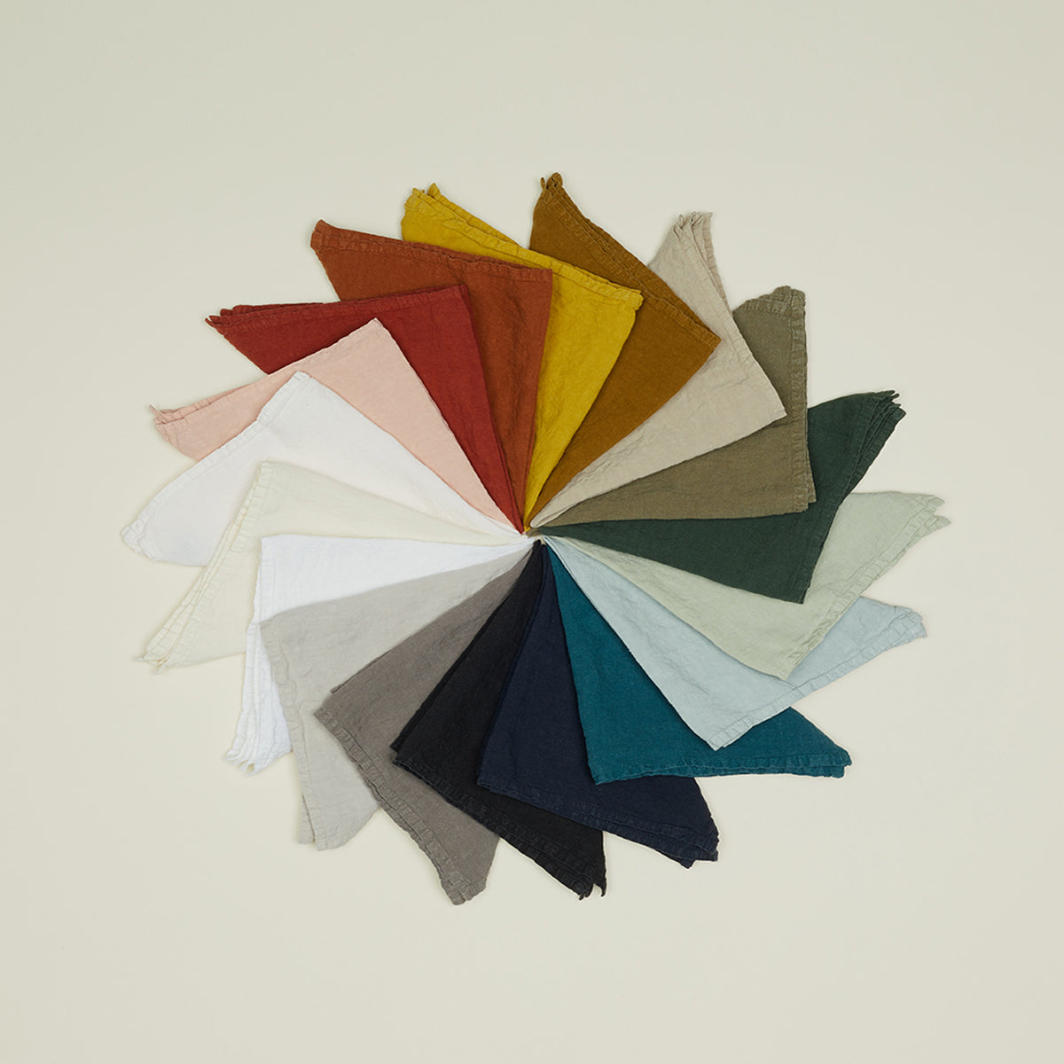
If you’re more of a detail person than a big picture person, the item method will be your best friend. With this method, you select items within certain rooms, spaces, or even for specific occasions, in colors that will match with what you already have in your home. The best items to use for this method are things like throws, pillows, vases, table settings, and wallpaper. Using the item method is our favorite way to bring color theory into a space because it doesn’t require an overwhelming amount of preparation and can often be done using things you already have and love. You can use this method to decorate a new space, bringing in a more energizing selection of home accessories, or refresh a familiar space for a new season. For example, as summer transitions into fall, you might switch your throw pillow covers from cream to mustard or decide to put up a wallpaper with terracotta detailing to make your space feel more cozy and warm.
While color theory is color-specific, you can easily amplify its impact by combining items in the colors you desire with a variety of different textures as well. Creating this contrast in your home decor is really what takes a space to the next level, adding depth and dynamism to each room. If you’re using this method to decorate as the seasons change, consider the textures that align with different times of year (rattan in the summer, wool in the winter, etc.) and spend some time trying out different combinations of these textures with your color scheme. For a texture and color one-two punch, we love adding a patterned wallpaper to an otherwise flat space to energize the room while making it feel more lived in. When experimenting with both texture and color additions, we recommend doing a little bit more preparation by hopping on Pinterest or consulting an interior designer.
Palettes
If starting with the fine details isn’t your style, this broad strokes approach of selecting a specific color palette to align with your mindset and desired outcome might be more appealing. Although both the item method and the palette method require a general understanding of color theory so everything is nice and harmonious, creating a palette works best when following the tenets of color theory as a starting point. Take the triadic colors. If you start your palette with this perfectly spaced selection of 3 colors that complement each other, you’ll immediately save yourself an aimless trip to your local home goods store’s paint swatch section. Another way to strategically implement color theory when creating your color palette is by choosing warm colors – red, yellow, orange, and colors with these hues – or cool colors – green, purple, blue, and colors with these hues – then building out the full palette from there. The best color palettes have a clear focal point (typically one or two main colors), with complementary colors used throughout the rest of your space. Once you’ve set your color palette, you can go on to choose the different home accents, glassware, and bedding to make your color dreams a reality.
A COLORFUL ENDING
Color theory and the psychology of color are a great way to make an upcoming decor refresh or decorating an entirely new space less daunting. Even though we love a good home update, this lovely process often lacks structure, quickly becoming a To-Do list item with no start or end date in sight. By using color theory whenever you’re adding new touches to any space, you can create a happier home (or a moodier one, depending on your end goal) much more easily. And because color is such a massive part of our everyday lives, you can use this priceless information in so many other ways – whether you’re shopping for clothes or merchandising your online shop. With fall steadily on its way, now is a great time to experiment with adding carefully selected colors into your home item by item or with your complete fall palette in mind, and watch each color-filled room become your favorite place to be.